Friday, 30 August 2013

Wet N Wild - Wild Shine "Ring In The Year" Disappointment? Review/Swatch


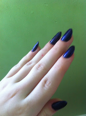
 6 months ago I bought Wet N Wild's nail varnish "Ring In The Year" from the Wild Shine collection. Fantastic dark purple colour with a deep blue shimmer, by far one of the shiniest I own making the dynamic flash of blue very visible and not one of those subtle "OH I PROMISE IT LOOKS LIKE THIS IN THE RIGHT LIGHTING" type of varnishes. And here are the swatches;

And here you can see the blue sheen I mentioned above
The print has worn away but here's the bottle's front


And then here's the polish on my hands (I am aware of how messy it is, it is justified)
Blue sheen is very visible

Most accurate image of the shade of purple and most visible air bubbles here

I did try correcting the uneven texture with clear varnish and then I tried distracting from it
with ELF's Fairy Dust varnish but it was beyond saving unfortunately

   And now here's where my disappointment and cause for messy application comes in - the application. I applied it in the same manner as I always apply my nail varnish, which normally gives me no problems, however the formula had gone very strangely thick and hard to get onto the brush this time. I managed to overcome this and apply it, however once it was dried and opaque I noticed a very big issue with the polish - the finish was very uneven as it was littered with air bubbles! If you consider how low res the images are yet how visible they are in these images it may give you an idea of how bad the air bubbles really were. It was simply unwearable and I didn't bother to clean up the polish as it was so bad I had to remove it as I wanted to scrape it off every time I caught sight of the polish. 
  The real disappointment here for me was that when I first bought the polish not too long ago the application was so much easier and so much better than how it is now, but regardless this wonderful colour that was one of my favourites is now beyond use and wear. Considering the average life of a nail varnish after opening is 2 years (24 months) minimum this was just beyond shocking for me.
  Overall would I buy it again? Probably not as the product seems to be discontinued now unfortunately, but even if it wasn't then probably not. The colour and finish was absolutely amazing and as I paid only 99p for it I was a happy camper, however for it to have gone off within a 6 month period is really just unacceptable. I have plenty of nail varnishes that cost both more and less that were stored in the same manner for far longer periods of time that I haven't faced this problem with. 
  If you knew about the issue with the product going off then you'd probably feel pressured to use up the product within those few months but if you didn't then you'd be a shocked customer with an almost full and useless bottle of product, much like myself. Either way it's an unfair position to be in as a customer so this really was a disappointment from Wet N Wild as they are one of my favourite cruelty free brands.


OPI Red Lights Ahead Swatch/Review

I recently got given OPI Red Lights ahead as a gift. The colour is an orange-based red so it has coral undertones and at times will appear more coral than red. 


The bottle itself looks like this, very simple and clean. You also get a fairly large amount of product which is good, however is a necessity due to the excessive pricing of this. 


 And here we have two swatches of the polish itself. On the left you can see that the colour makes for nice Instagram photos  (important information for any nail varnish you're potentially buying) and looks very vintage and classy as the plain classic red manicure. On the right I've taken a picture holding a Coke can to get an idea of the red that the polish is as they match exactly.


Now for the performance of the polish - overall brilliant. Very easy to apply, nice formula. Took roughly 3 coats to be opaque as mine are very thin in terms of application. The formula was quite thin but without being runny so it was very smooth and easy to apply. It also managed to not cause any kind of air bubbles after the 3 coats and without a clear top coat so I was very impressed by this. The drying times were also fairly quick and I didn't have any issue with them. Finally the main thing I was impressed with was chip resistance - all the images above were taken between 1-2 weeks after application and my nail polish hadn't budged an inch. It neared 3 weeks before I took it off due to boredom and still at that point there was no chipping! 

This polish is amazing and would definitely be one of my favourites in almost all aspects except for pricing. I will not be buying this for myself again though as unfortunately OPI are not a cruelty free brand due to their parent company being Coty (a big name in animal tested cosmetics, owns brands such as Rimmel that are renowned for testing). OPI do not directly test on animals as a brand, however their profits go and fund Coty who do when it's completely unnecessary so despite how great I feel that this varnish is my money will be going towards quality cruelty free brands' varnishes such as ELF or Barry M in the future (and both are vegan)!

Wednesday, 14 August 2013

FULL METAL ALCHEMIST NAILS

I recently got my first nail art brushes free with a purchase much to my surprise. I've been itching to use them for a while so decided to do FMA nail art. My hand ended up looking like this; 
(Please note that all images featured can be viewed as a larger preview by clicking on them.) Quite horrific I know, but for a first attempt at nail art (which involved doing heavily detailed designs on a tiny surface, why did I think this was a good idea...) with brushes that I later found out were of horrible quality and swapped to using toothpicks instead I was quite happy with the fact there was some resemblance, even if it was textured and uneven.


Here is definitely the nail I was proudest of -  a chibi Alphonse. Based on the reference picture next to it I found this little guy to be a very cute addition to my thumb.


Next up is an apparently poorly photographed version of the homunculus symbol that's missing the dragon eating it's own tail however as there wasn't enough space - meaning that this is basically triangles. Just triangles. Yep.


For my ring finger I just chose a plain red accent nail as it went with the colour theme running through and broke up my nails that were so busy and filled with detailing. On my pinky however I had one of the most complex nails from this design - Alphonse's blood seal. I actually managed to execute the design quite well, except for having to leave out the circle due to spacial issues, however applying a clear top coat caused the red to bleed into the white and ruined the intricacy of the design that is also upside down in this photo apparently. 


The last nail I apparently didn't get chance to photograph individually but it was the second white one from the group nail shot, the index finger. For this nail I chose to do the Flame Alchemist symbol that's featured on Roy Mustang's gloves. This also came out fairly bumpy, however the design was quite visible to an extent so I'm going to say this was a pass but not quite a success.

And that's my first attempt at nail art - a complex symbol filled FMA manicure. Definitely quite bad as nail art goes but still only a first attempt so hopefully I'll progress, maybe practising more simple designs before reattempting this is a good plan. So how did I do? Leave me feedback, nail art tricks and tips or simple design concepts in the comments below. I also now have a subscribe via e-mail button at the side of the page so now it's easy to keep up to date with the latest posts from this blog so subscribe away!


Thursday, 8 August 2013

Teal with Aqua Glitter Tips

In my last post I mentioned finding a glitter polish by Barry M that I loved. Naturally the next time I was headed into Superdrug I grabbed it and a matching polish to add to my collection. I wanted to use both as the colours were so complimentary and matched so well, yet I didn't want to replicate my previous look of the glitter gradient.


Glitter Gradient done prior

To alternate things but still use a plain polish and glitter I ended up with glitter tips as seen above. They looked phenomenal, far better than pictured. Definitely one of my favourite looks to date. The glitter polish (Barry M Glitter in Aqua) was just as easy to apply as I remembered, however the matching polish (Barry M in Racing Green) was new to me entirely. It took 4 coats to get an opaque finish, but even then it took over 2 hours to dry when I apply very thin coats of polish so the formula/application I'm really not a fan of. The colour is so fantastic though I am willing to overlook the bumps and ridges it gave me from the application.

Blue Glitter Gradient

Last week I was staying around a friend's house and my nail polish started to chip so obsessively I had to pick it all off as I cannot stand chipped nails. Thankfully she knows how obsessed with nails I am (and after breaking one of my nails by accident...) let me borrow some of her polishes to do mine with while I stayed.
I didn't have any tools with me and I cannot tolerate flat nails lately so I made the most out of what I had and used 2 Barry M polishes to create this glitter gradient, one was Barry M Glitter in Aqua. I was really happy with how vibrant and complimentary the colours were for this look. Very simply and easy to do.

Louboutin Inspired Nails

3 weeks ago I did this set of nails;


The concept behind these was imitating the red sole seen on Louboutins as my nails were finally long enough to do this with. I finished it off with an accent nail by painting a few coats of E.L.F's 'Fairy Dust' chunk duochrome glitter varnish as a topcoat. I really liked how sleek and simple these nails looked as well as how quick and simple the application was. Definitely a style I'd like to replicate in the future.